.svg)

Purpose-built CFO dashboard can help you make faster decisions, optimize costs, improve cross-functional visibility, and proactively manage risks. Learn what metrics to track in your dashboard, how to customize it for different needs, and best practices for implementation.
Your financial data tells crucial stories about your SaaS company's trajectory, but without proper visualization, these insights remain buried in a spreadsheet.
A well-designed CFO dashboard bridges this gap by transforming scattered financial data into actionable data. It enables finance leaders to spot trends, anticipate problems, and confidently guide strategic decisions before issues become crises.
This guide will walk you through what a CFO dashboard is, critical metrics to include, and practical ways you can customize the dashboard. You'll also learn how the right visualization tools transform finance from backward-looking reporting to forward-thinking strategic leadership.
What is a CFO dashboard?
A CFO dashboard is a visual hub that turns financial information into actionable insights. It displays metrics that impact your business growth directly in real time.
For early-stage SaaS start-ups where every revenue decision has repercussions, CFO dashboards provide preemptive alerts that help eliminate information delays and make proactive intervention possible.
CFO dashboards also provide the means for thoughtful analyses of complex stakeholder queries. They explain the correlation between business metrics, for instance, why revenue keeps falling even when new customers are being added, or how changes in price impact the acquisition cost and the value of a customer in the long run.
Three key capabilities make modern financial dashboards particularly powerful:
- Real-time data integration that pulls information directly from your financial systems
- Cross-functional visibility that connects financial metrics with operational KPIs
- Forward-looking analytics that help forecast scenarios based on current trends
This proactive approach transforms the finance function from merely reporting past performance to actively shaping future strategy. When CFOs can tell compelling data stories—showing exactly how a concerning churn trend connects to product usage patterns or how specific spending inefficiencies directly impact runway projections—they influence decisions in ways that raw numbers alone never could.
CFO dashboards vs CFO reports
In short, CFO dashboards provide immediate visibility into your company's financial pulse, while CFO reports deliver the in-depth analysis you need for deeper strategic planning.

While both the dashboard and report differ in many ways, they align perfectly in their purpose: driving better financial decisions.
CFO dashboards shorten the decision cycles. When a critical metric like your net dollar retention rate suddenly drops, the dashboard immediately alerts you letting you fix the issue before it escalates.
Reports, by contrast, provide the in-depth context necessary to understand long-term patterns such as why your retention rate might be declining across specific customer segments over multiple quarters. This combination transforms raw numbers into actionable intelligence—exactly what today's CFOs need to drive strategic advantage.
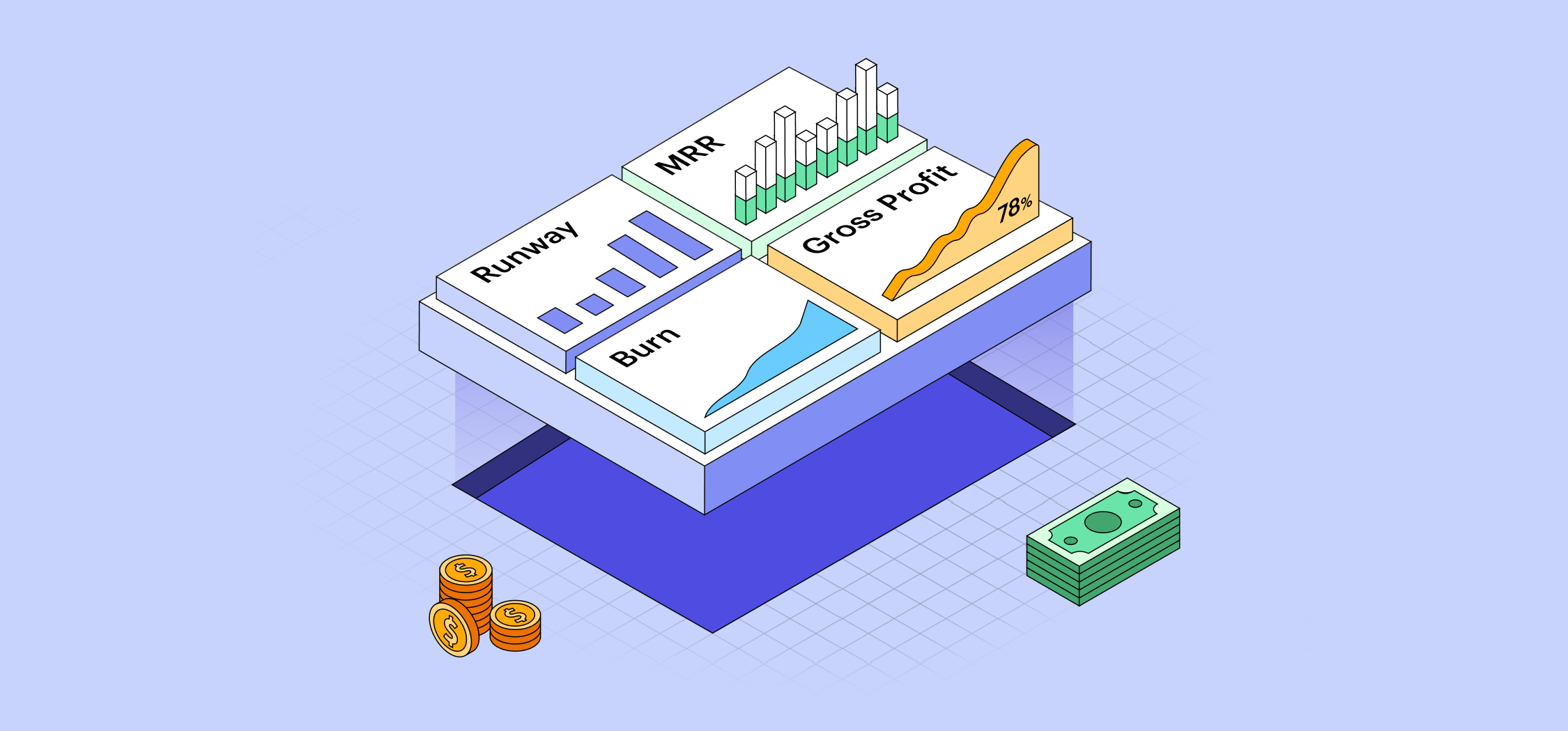
12 essential metrics to include in your CFO dashboard
With dashboards and reports working in tandem, the next question becomes: what exactly should you monitor?
For early-stage SaaS companies, certain financial metrics serve as vital signs that indicate your company's health and trajectory. Including these on your CFO dashboard transforms it from a mere reporting tool into a strategic command center.
Here are the essential metrics every SaaS CFO dashboard should track:
1. Monthly recurring revenue (MRR)
MRR shows the stable, recurring income your SaaS business can count on each month. When MRR grows consistently, so does investor confidence. Put simply, track MRR closely to spot revenue issues before they become existential problems.

2. Customer acquisition cost (CAC)
CAC reveals how efficiently you convert marketing dollars into paying customers. When CAC rises without corresponding revenue growth, your marketing strategy may be to blame. Monitoring this metric helps you fix that before it burns through your runway.

3. Customer lifetime value (LTV)
LTV estimates the total revenue individual customers generate during their relationship with your company. This metric helps determine how much you can reasonably spend to acquire customers while remaining profitable.

4. Gross profit and net profit
Gross profit indicates the efficiency of your core operations, while net profit accounts for all expenses, showing your true bottom-line performance. These fundamentals belong on every CFO dashboard as they cut through any vanity metrics to show actual business health.

5. Burn rate
Burn rate shows how quickly your company spends capital, typically measured monthly. For pre-profitable SaaS companies, this metric directly impacts survival—when paired with cash reserves, it determines your runway.
Tracking burn rate prominently on your dashboard keeps cash consciousness at the forefront of decision-making.

6. Churn rate
The churn rate is the percentage of customers who cancel or don’t renew subscriptions within a specified period.
Including churn rates on your dashboard will help you spot retention problems before they start affecting your business revenue. For instance, a sudden spike in churn might be a symptom of underlying product, competition, or customer service problems that need immediate resolution.

7. Cash runway
Cash runway marks the number of days your company is able to operate at the current burn rate before running out of cash. This metric is very important for planning fundraising activities strategically to prolong the lifespan of the company.
Being able to monitor this metric on the dashboard is crucial so that fundraising programs take place long before the cash is critically low.

8. SaaS quick ratio
The SaaS quick ratio evaluates how efficiently your company is growing by how much new and expansion MRR you get versus how much MRR you lost. Anything above a four indicates healthy growth and anything below one indicates that the company is contracting.
Incorporating this ratio on your dashboard offers a simple yet powerful way to capture the interrelationships between growth and churn. It helps answer an important question: Are we growing fast enough to offset our losses?

9. Rule of 40
According to Rule of 40, a healthy SaaS company should have a combined growth rate with profit margin of more than 40%. The metric helps to avoid focusing entirely on either growth or profitability at the expense of the other.
For venture-backed companies, having this metric on the dashboard helps ensure that the growth and profitability balance that is required is being met. It is particularly useful when planning strategic shifts during growth and profitability stages.

10. Net revenue retention (NRR)
Net revenue retention (NRR) (also known as net dollar retention or NDR) indicates the changes in revenue from existing customers during a period of time along with their expansions, contractions and churns. Any NRR above 100% means that your customer base is increasing in value even without having new customers.
This metric is more important for enterprise SaaS, where expansion revenues are the leading revenues for the company. Having NRR on the dashboard makes it easier to track the performance of customer success and upselling strategies.

11. Magic number
The SaaS Magic Number tracks sales efficiency by measuring how much revenue is earned for each dollar spent on sales and marketing. When your Magic Number is greater than 1, it indicates that it’s time to increase spending to create growth, while values lower than 0.5 indicate you probably need to re-evaluate your acquisition model.
Including the Magic Number on the dashboard enables you to better manage go-to-market expenditures. Therefore, it is especially valuable when deciding whether to accelerate or throttle back on sales and marketing investments.

12. Operating cash flow
Operating cash flow is the measure of cash obtained from running the business excluding your investments and financing. In the case of a SaaS company, this metric shows whether your business model actually generates cash or consumes it.
Positive operating cash flow means your business is self-sustainable while negative cash flow means it is dependent on external financing. Having this metric in your dashboard allows you to identify potential cash crunches that may not be apparent immediately from the profit figures available.
By combining these twelve metrics in your CFO dashboard, you create a comprehensive view of your SaaS company's financial health that balances short-term performance with long-term sustainability. The dashboard becomes not just a reporting tool, but a strategic compass that guides decision-making across the organization.
How to customize your CFO dashboard
While tracking all twelve metrics provides comprehensive visibility, effective CFO dashboards aren't one-size-fits-all.
Instead, create focused views for specific needs rather than cramming everything into a single overwhelming interface.
By creating purpose-built dashboards tailored to specific financial needs, you transform raw metrics into decision-driving insights.
Here’s how you can customize your CFO dashboard:
- Define a specific purpose tied to key decisions.
- Include only metrics directly connected to those decisions—resist metric overload.
- Add context through trend indicators, benchmarks, and thresholds that transform numbers into insights.
- Match appropriate visuals to your data. For example, use line charts for trends and bar charts for comparisons. This is important as poor visualization choices can slow decision-making.
- Review the dashboards quarterly. Eliminate unused metrics and refine them based on actual usage.
Here are some different types of CFO dashboards to consider when building yours.
1. Cash flow analysis dashboard
A cash flow analysis dashboard helps you track your company's cash position in real time, ensuring there’s enough liquidity to sustain operations. Most importantly, a cash flow dashboard provides early warning signals for potential liquidity challenges months before they would appear in traditional financial reports.
Key metrics to include:
- Current cash balance with trend line: Shows available resources and directional movement
- Net burn rate: Reveals how quickly you're consuming cash
- Cash runway projection: Visualizes exactly when you'll need additional funding
- Cash inflows and outflows: Breaks down sources and uses of cash
- Collections efficiency: Highlights potential accounts receivable bottlenecks
2. Income statement analysis dashboard
While traditional income statements (commonly referred to as profit and loss or P&L) provide the facts, an income statement dashboard reveals the story behind your financial performance. This dashboard helps you understand the relationships between revenue growth and profitability metrics in real time.
Key metrics to include:
- Revenue with growth rate: Shows top-line momentum
- Gross margin percentage: Reveals product delivery efficiency
- Expense composition: Breaks down spending by category
- Expenses as percentage of revenue: Highlights scaling efficiency
- Rule of 40 performance: Balances growth against profitability
This visibility is particularly valuable during strategic inflection points. When deciding whether to prioritize growth or profitability, this dashboard shows exactly where each additional dollar of spending is going and what return it's generating. This allows you to fine-tune your strategy based on real-time feedback rather than quarterly reviews.
3. Customer economics dashboard
For subscription businesses, unit economics ultimately determine long-term viability. This dashboard focuses on the metrics that reveal whether your customer acquisition and retention strategy is economically sustainable.
Key metrics to include:
- Customer acquisition cost (CAC): Shows investment required to acquire new customers
- Customer lifetime value (CLTV): Reveals expected return from each customer
- CLTV ratio: Provides quick insight into acquisition efficiency
- Net revenue retention: Shows expansion and contraction within existing accounts
- CAC payback period: Indicates time to recoup acquisition investments
- Magic number: Measures sales and marketing efficiency
These dashboard examples represent starting points—you should customize them based on your company's specific business model, growth stage, and strategic priorities.
The 5 key benefits of using a CFO dashboard
A well-designed CFO dashboards deliver tangible advantages that transform how finance teams operate and contribute to company strategy.
Faster decision-making
CFO dashboards compress the time between receiving information and taking action. This speed advantage becomes particularly valuable during market volatility, when quick, informed decisions can mean the difference between capitalizing on opportunities and missing them entirely.
Strategic cost optimization
Dashboards enable precision cost optimization by revealing the relationship between spending and outcomes. The improvement comes from their ability to identify underperforming investments in real-time, track acquisition costs across channels, monitor efficiency metrics during scaling, and flag anomalies before they become embedded problems.
Enhanced cross-functional visibility
When finance dashboards are shared across departments, they break down information silos and create alignment. This visibility particularly benefits SaaS companies where teams often operate independently despite their interdependence. When marketing sees the CAC implications of campaigns and product teams understand the revenue impact of feature updates, organizations make better collective decisions.
Automation and efficiency
Dashboard automation eliminates the manual reporting tasks that traditionally consume finance teams' time. This efficiency translates directly to cost savings and allows finance professionals to focus on analysis and strategy rather than data gathering. Beyond time savings, automation significantly improves data reliability by reducing human error rates.
Proactive risk management
Perhaps most valuable in today's volatile environment, dashboards enable risk detection before problems become crises. This early warning system helps finance teams identify potential cash flow issues, customer churn patterns, underperforming acquisition channels, and pricing strategy outcomes before they significantly impact the business.
By implementing comprehensive CFO dashboards, SaaS companies can transform financial management from a backward-looking accounting and reporting function to a forward-looking strategic advantage that drives better outcomes across the organization.
How Drivetrain elevates your financial dashboards
Most dashboard tools force SaaS finance teams to manually update spreadsheets and cobble together disconnected metrics. Drivetrain eliminates these headaches.
Dental Intelligence is a good example of this. The company's finance team used to spend hours manually updating dashboards with data from multiple systems, leaving little time for strategic analysis. After implementing Drivetrain the team was able to automate their financial data flows along with creating customized views per stakeholder.
Like Dental Intelligence, many teams have reclaimed countless hours and elevated their strategic impact by replacing manual processes with Drivetrain's purpose-built CFO dashboards.

Ready to transform your financial data into a strategic advantage?


.webp)


